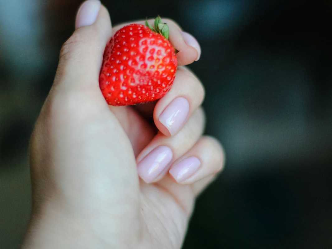
 (Image via
Cooking used to be about survival and sustenance, but today it is a visual language that speaks to us long before we take a bite. Scrolling through social media feeds filled with perfectly lit avocado toast or browsing cookbooks with glossy, high-definition spreads changes how we approach our own kitchens. We aren't just looking for instructions on how to make dinner; we are consuming a visual promise of what that dinner should be. This phenomenon is known as culinary iconography—the use of visual images and symbols to represent food—and it fundamentally alters our expectations. Understanding the mechanics behind these images reveals why your homemade dish might taste delicious but still feel like a failure if it doesn't match the photo.
The Art of Visual Storytelling in Food
Food photography has evolved far beyond simple documentation. It used to be that a photo just showed you what the finished casserole looked like. Now, imagery serves as a complex form of storytelling that engages our emotions and memories. Prints4Sure explains that food photography has transcended its utilitarian roots to become a vibrant medium that provokes sensory experiences. It captures narratives, like the rustic charm of a farmhouse table or the sleek precision of a modern kitchen.
This shift means that when you choose a recipe, you are often choosing a "vibe" or a story rather than just a flavor profile. Editorial photography, found in lifestyle magazines and cookbooks, often evokes nostalgia or celebration. It uses natural light and imperfect props—like a crumpled linen napkin or a scattering of crumbs—to make the food feel authentic and attainable, yet undeniably beautiful. These artistic choices subconsciously tell us that if we cook this recipe, our lives will look just as curated and peaceful as the image.
The Psychology of the Plate
Our brains are hardwired to make judgments about food based on how it looks. This concept goes deeper than just "looking yummy." Recent scientific research suggests that the aesthetic appeal of the surroundings, specifically the plate itself, changes how we perceive taste and healthiness. A study published by PMC found that food presented on beautiful plates was perceived as tastier and healthier than the exact same food served on less attractive dishes. This is known as a "halo effect," where the beauty of the presentation spills over into our judgment of the food's quality.
The study dug even deeper, distinguishing between "classical aesthetics" (clean, orderly, symmetrical) and "expressive aesthetics" (creative, unique designs). Interestingly, the research showed that classical designs often induce a preference for balanced, central plating, while expressive designs trigger different emotional responses. This means the iconography on your dinnerware—the literal patterns on your plates—can trick your brain into thinking a meal is more nutritious or expensive than it actually is.
Iconic Figures and the Roots of Expectation
We can't talk about culinary expectations without looking at the people who set the standards. The University of Alberta highlights how famous culinary figures, or "food icons," have shaped the region's gastronomic identity. Figures like Martha Stewart or Julia Child didn't just share recipes; they established the visual benchmarks for what "good" home cooking looks like. Martha Stewart, for example, taught generations that the perfect meal is an inseparable blend of food and presentation. Her influence cemented the idea that hosting is an art form, where the tabletop décor is just as important as the roast chicken.
These icons act as the original influencers. They created the visual vocabulary we still use today. When you see a perfectly lattice-topped pie, you aren't just seeing a dessert; you are seeing a symbol of domestic competence established by these culinary pioneers. Their legacy lives on in how we judge our own efforts. We often feel pressure to live up to these historically high standards, forgetting that these icons had teams of stylists and test kitchens supporting them.
Modern Plating Trends and Visual Cues
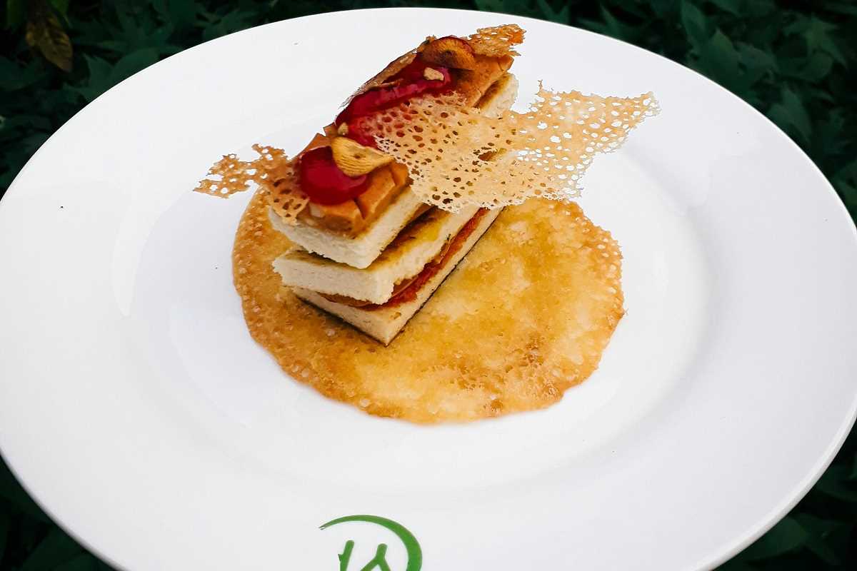
Chefs today use the plate as a canvas, and understanding their techniques can explain why restaurant food looks so different from home cooking. Unilever Food Solutions outlines several modern plating trends that define current culinary iconography. For instance, the "Landscape" technique takes inspiration from gardens, arranging food in a low, linear format. Then there is "Free-form" plating, which might look carelessly strewn but is actually a calculated abstract painting of sauces and ingredients.
Another popular style is the "Nordic Look," which uses negative space and organic arrangements of pickled vegetables and herbs to suggest freshness and minimalism. These styles do more than just make food look good; they signal specific values. A "futuristic" plate using sleek metal or glass signals innovation and modernism. A dish served on slate or wood signals a "farm-to-table" rusticity. Recognizing these visual codes helps you understand what a recipe is trying to sell you. It also liberates you from thinking you did something wrong just because your spaghetti dinner doesn't look like a piece of abstract art.
The Recipe as Generative Art
There is a tension between the rigid expectations set by photos and the creative reality of cooking. Root Kitchens suggests that we should view recipes as a form of generative art. A recipe isn't a strict set of laws; it's a starting point for your own creativity. The problem arises when we treat the accompanying photo as the only correct outcome.
Sometimes, highly stylized photos can actually detract from the cooking process. They place implicit restrictions on how a dish "should" look, discouraging experimentation. If your sourdough bread doesn't have the exact same "ear" or open crumb structure as the photo in the blog post, you might feel like you failed, even if it tastes incredible. Root Kitchens argues that seeing recipes as a creative endeavor—problem-solving, curiosity, ingenuity—is healthier than trying to mimic a static image. The text of a recipe invites you to participate; the image often just invites you to compare.
Actionable Insights for the Home Cook
You don't need a professional studio to make your food look appetizing, nor do you need to be a slave to unrealistic images. Here are some ways to navigate culinary iconography in your own kitchen:
1. Separate "Editorial" from "Educational"
Recognize the purpose of the image you are looking at. Is it an editorial shot meant to sell a lifestyle, or is it an educational shot meant to show texture? Prints4Sure notes that social media food photography often leans on relatability and spontaneity, whereas commercial shots are engineered for perfection. Don't hold your Tuesday night dinner to the standard of a commercial shoot where the ice cream is actually mashed potatoes (a common stylist trick!).
2. Upgrade Your Canvas
Remember the "halo effect" mentioned in the PMC study. You can improve the perceived taste of your food simply by serving it on a plate you find beautiful. You don't need expensive china; even a clean, classic white plate can make colorful ingredients pop and signal "freshness" to your brain.
3. Play with Plating
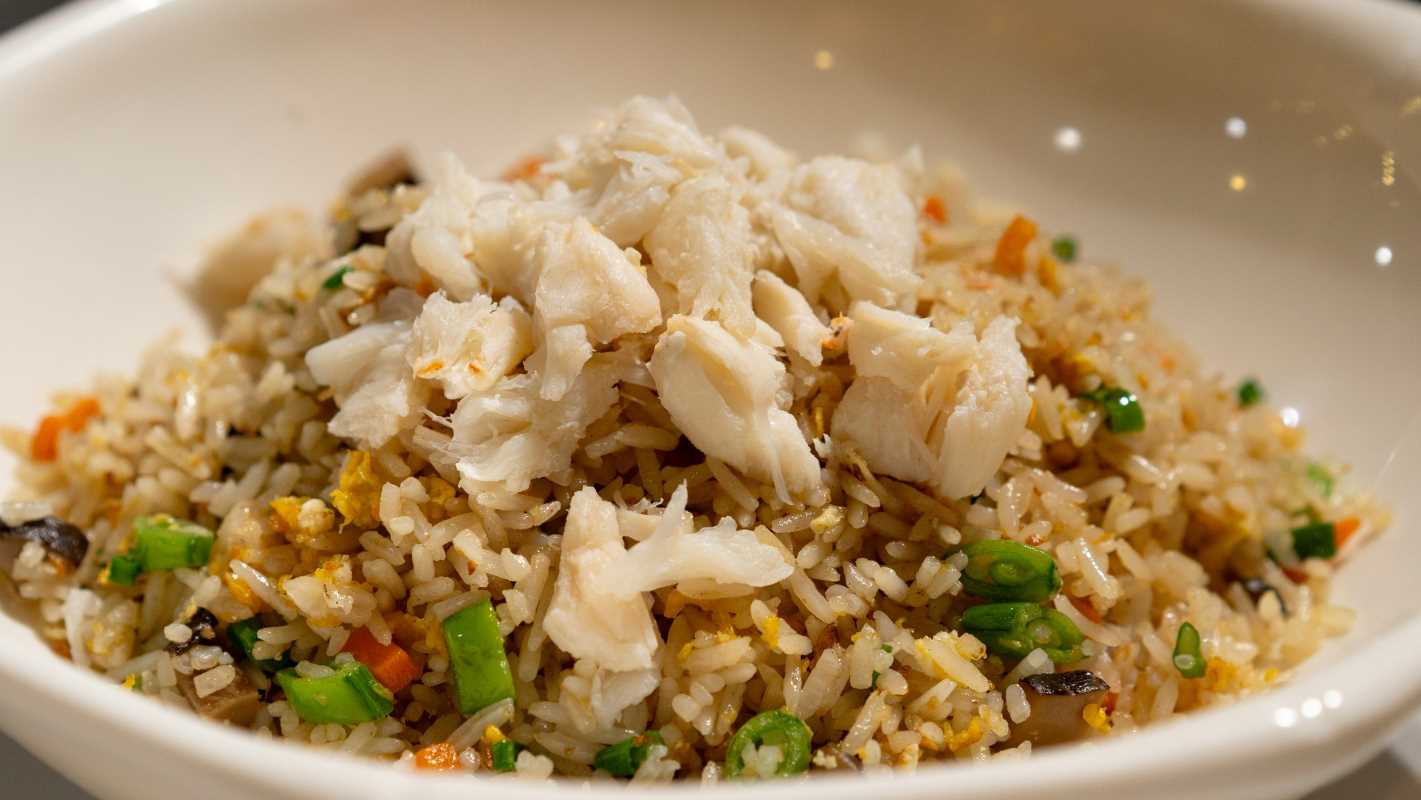
Try a technique from the professional world. Unilever suggests the "Hide and Seek" technique, where you layer ingredients to create surprise—like hiding crab meat under a puffed rice cracker or tucking berries under a dollop of cream. It adds a layer of playfulness without requiring professional knife skills.
4. Trust Your Palate Over the Picture
Visuals are powerful, but flavor is paramount. Use recipe photos as inspiration, not a scorecard. If a recipe writer styled a stew with fresh herbs that you don't have, your stew isn't "wrong." It's just different. Focus on the sensory cues described in the text—smells, textures, and tastes—rather than just the visual icon at the top of the page.